Three Peaks Design logomak.three peaks logotype.

South pacific calibration

Accuracy, Done Right

The Project

South Pacific Calibration (SPC) had the expertise and a solid client base, but without a clear visual identity or online presence, growth was starting to feel limited.

The challenge was to create something bold and distinctive in a space that often feels generic and overly corporate. SPC wanted to differentiate from competitors while still communicating precision, reliability, and credibility.

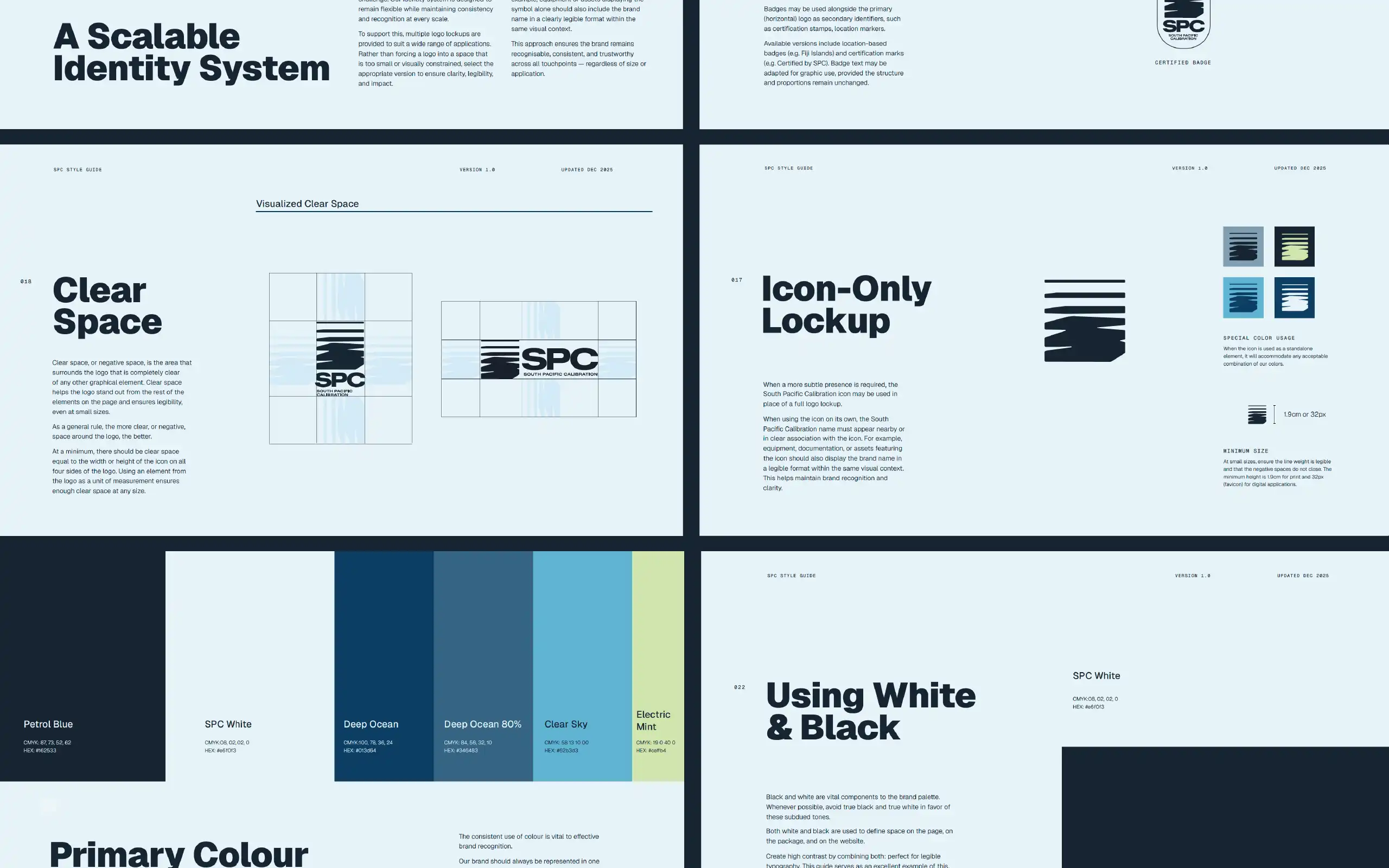
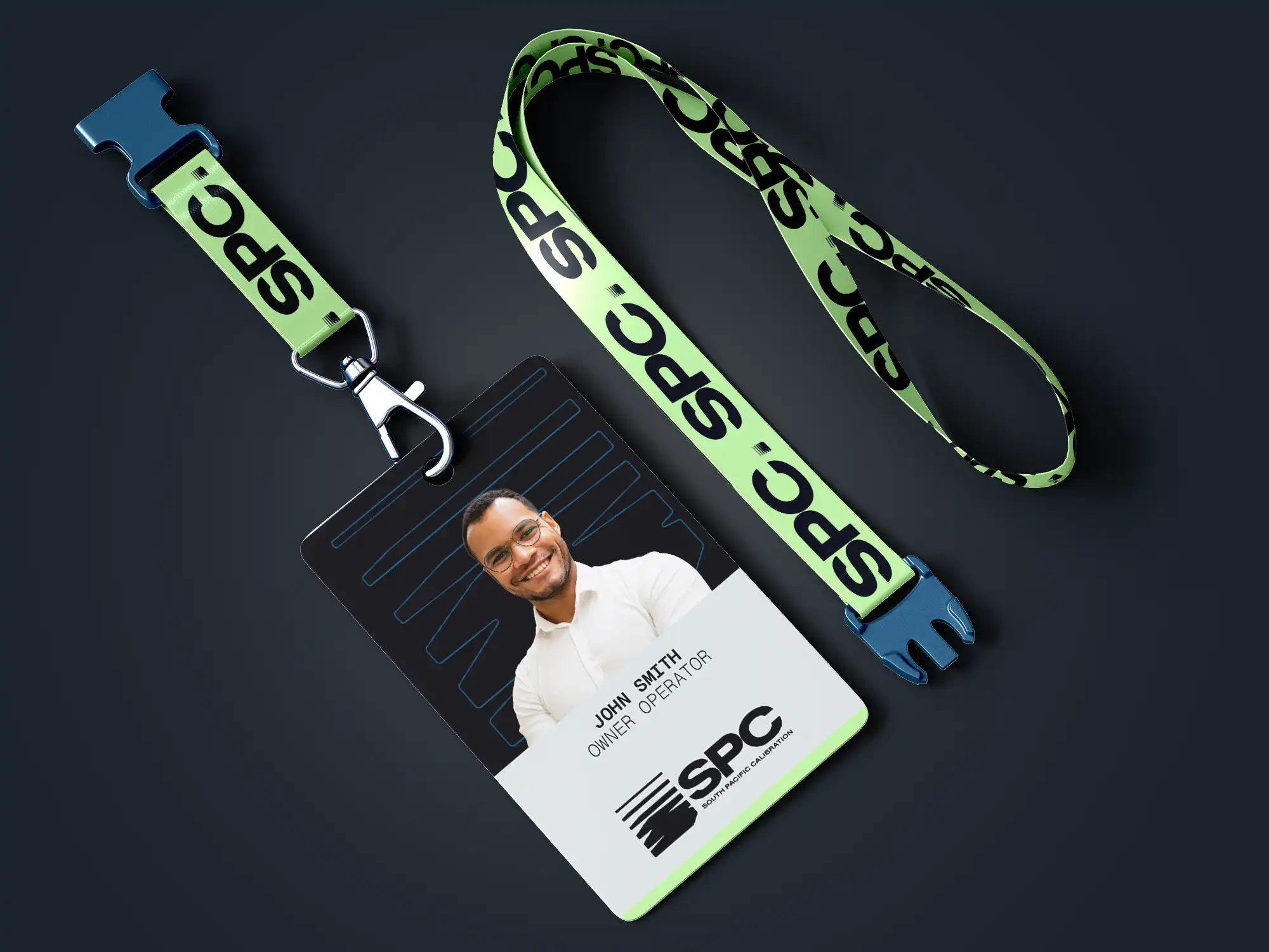
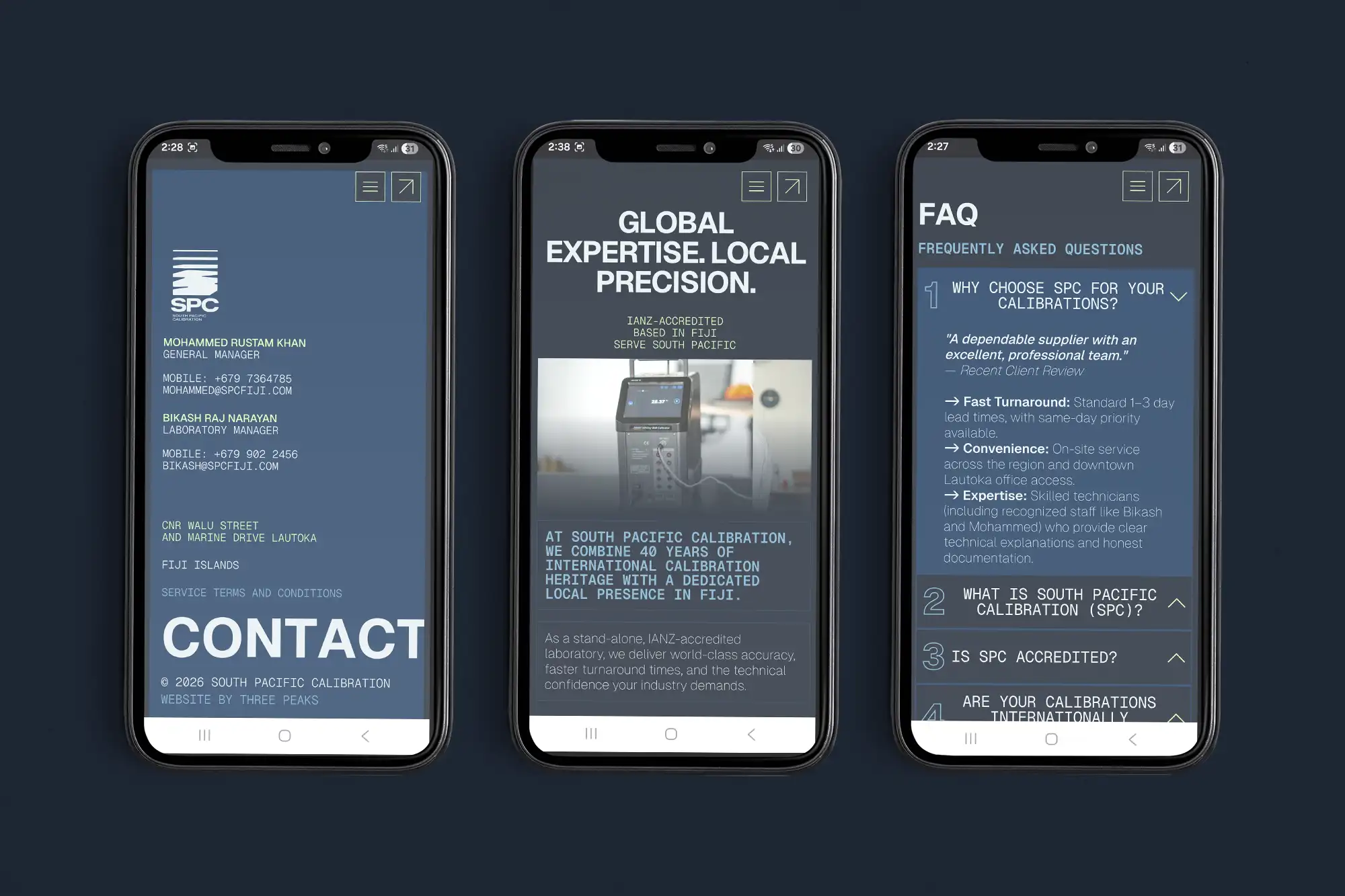
The project involved developing a strong visual identity from the ground up, including logo and brand direction, followed by a bold, responsive Webflow website.

Check live website:
South Pacific Calibration

overview

Established in Fiji, South Pacific Calibration (SPC) provides specialised calibration services for industries where precision is critical.

Their work helps businesses operate with confidence, knowing their measurements can be trusted. As they grow across the Pacific, SPC continues to build a reputation as a reliable, no-nonsense partner for accuracy.

services

Logo
Visual Identity
Website

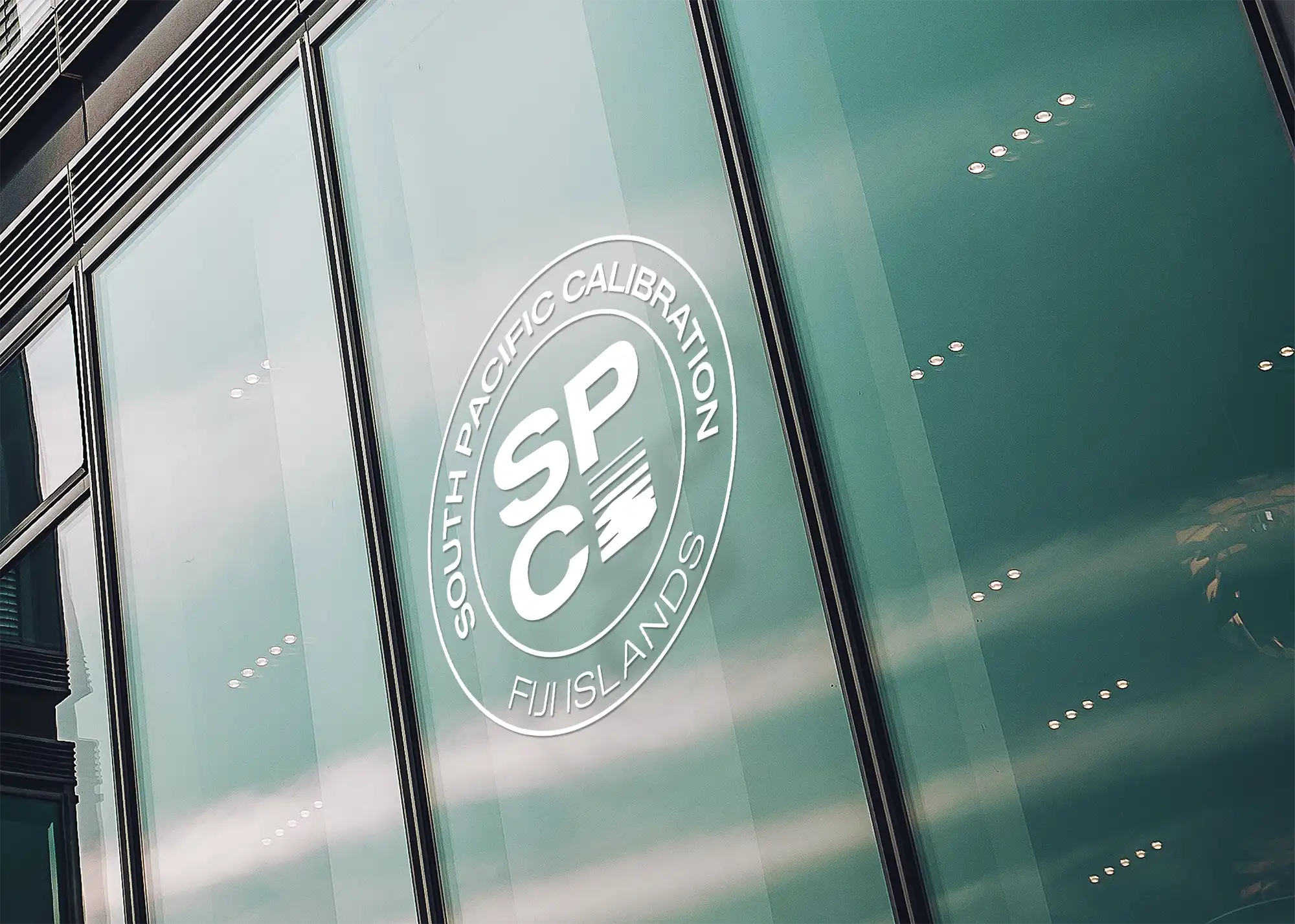
What the mark stands for

PRECISION. CONSISTENCY. TRUST.
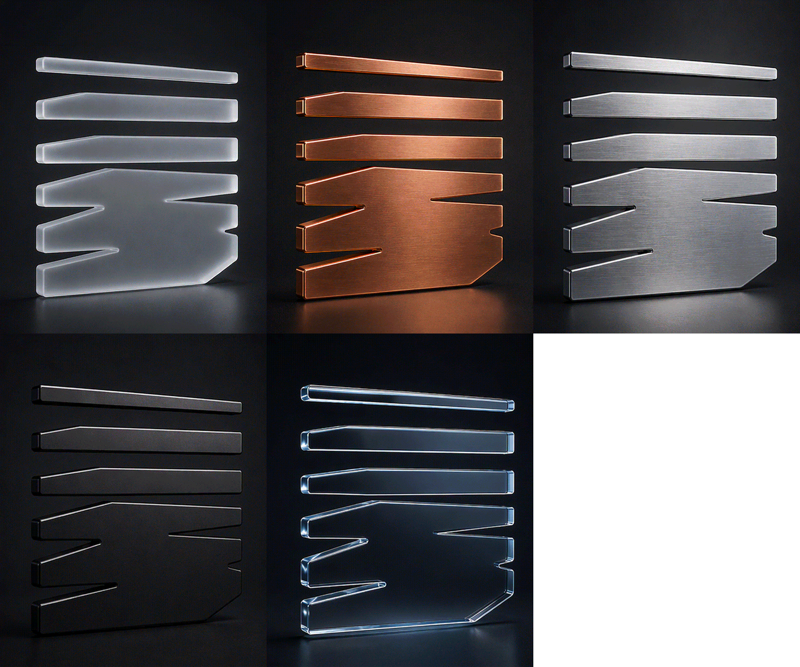
The stacked horizontal forms tell a story in motion:

  • The bottom lines shift, distort, and expand, creating a sense of movement and calibration.
  • The upper line is clean and straight; it represents the adjusted accuracy, standards, and control.
  • This controlled distortion symbolises the before state, measurements that require adjustment, alignment, and verification.
  • The overall effect feels like fading in and out, visually showing the calibration process: testing, adjusting, refining, and locking into accuracy.

The mark is intentionally:
Heavy: The visual weight conveys seriousness and authority
Dense: Suggest depth of expertise
Grounded: Communicate reliability, consistency, and trust

more work